This paper originally appeared in Sound & Vibration Magazine, October 2009, pp. 8-16.
Download PDF
“How come when I run a random test the spectrum looks so ragged?” is a frequently asked question. It is actually a far deeper question than most interrogators realize. This article reviews the statistical nature of a random test’s spectra. We will provide an answer to this nagging question; provide some valuable test planning information and present methods to evaluate your controller’s statistical performance.
Random shaker tests have been used for nearly six decades, but few modern practitioners thoroughly understand the statistical mathematics governing the physics of such tests. Gaussian noise deserves a little quiet study before embarking upon your next laboratory exercise. There is a rampant misunderstanding about random test measurements within the testing community. This article should help you better understand the relationships between averaging, resolution, and minimum measurement time. This will allow you to better access the technical difficulty (or feasibility) of performing a particular random test.
Of course, it is important to know that you can trust all of the settings on your controller. Our analysis of competitive units accepted as trade-ins indicates that not all instrument designers fully understand random signal statistics. Methods are presented that allow you to test your controller’s performance and to determine if its designers understand random signal expectations as well as Johann Carl Friedrich Gauss (1777 to 1855). Such an examination will prove to be time well spent. You will better understand your chosen tool and come to have far greater (dare we say?) confidence in its application.
By Way of Introduction
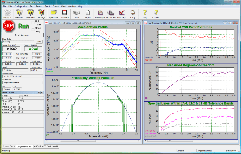
Figure 1: Vibration Research 8500 controller provides multiple statistical views of a random vibration test. PSD of Control overlays Demand (between Alarm and Abort limits) at upper left. Measured (log amplitude) PDF overlays Gaussian bell at lower left. Time histories of PSD Roof, Floor, Degrees-of-Freedom and % Lines within 1, ½ and ¼ dB of Demand at right.
A closed-loop random vibration controller functions to produce a transducer-sensed shaped-random Control acceleration with power spectral density (PSD) closely matching a Demand spectrum (or target profile) of g2/Hz dimension. It does so by generating a random Drive signal that is power-amplified and applied to the shaker. The Control acceleration is expected to exhibit Gaussian amplitude statistics as demonstrated by a bell-shaped or normal probability density function (PDF). The PDF is expected to show a mean value, μ, equal to zero and (approximately equal) extreme positive and negative peak amplitudes exceeding ±3σ, where σ is the standard deviation (the RMS value when μ=0).
All of this seems like a tall order, but modern vibration controllers meet all of these objectives (and more), enabling a broad range of electrodynamic and hydraulic shakers to test an ever-broadening population of test articles to ever more stringent and sophisticated simulations of life’s environment. One of the statistical givens for any random controller is that both the variance (σ2) and the PSD of the Control are governed closely by Chi-square (χ2) statistics, these being reasonable statistical expectations of Gaussian time history.
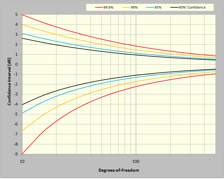
Figure 2: Confidence Limits (± dB) for a χ2 variable such as PSD magnitude.
Figure 2 illustrates a fundamental expectation for any random shake-test: the measured amplitude of every g2/Hz PSD spectral line of the Control signal will be governed by predictable (±dB) confidence limits derived from the χ2 distribution. In fact, this expectation proves reasonable day after day in shaker labs around the world. We have come to accept that we live in a world characterized by signals of Gaussian mean and Chi-square variance. For rapid reference, key points from Figure 2 are also presented in tabular form in Table 3 of the appendix.
The curves of Figure 2 illustrate statistically reasonable bands of variation for a g2/Hz value with regard to two variables: confidence and degrees of freedom. Statistical confidence is usually expressed as a percentage. For example, 99.9% confidence is shorthand for saying 99.9% of the spectral lines in a PSD will be within the curve-specified upper and lower bounds. Degrees of freedom (DOF) is a statistical term synonymous with the χ2 distribution. With respect to controllers, it describes how much averaging, or smoothing, is used in the analysis of a signal to provide a PSD. Please read that last sentence again. DOF is not a property of the Control (or Drive) signal; it is a selected characteristic of the analysis of that signal.
The visual difference between the Control PSD and the Demand is often thought of as the control-loop error. In fact, it is a display of the summation of two errors: the loop error and the PSD estimation error. The latter of these is described in Figure 2. The loop error is the difference between the expected or central value of the Control PSD and the Demand profile. The PSD estimation error is the natural scatter of measurement about the expected value. If we could average the Control PSD forever, it would converge to the expected value and any deviation of this result from the Demand would be the loop error. This is impractical; we must make do with an estimate averaged over a finite amount of time.
Hence, the loop error can never be certain to better than the scatter of the PSD estimation error. As intuition might suggest, as more estimates of the Control PSD are averaged, the display process tightens and the estimated Control PSD more closely approaches the desired central value, giving a clearer view of the match to the Demand at every frequency. However, while averaging reduces the PSD estimation error, it also blurs the detection of any dynamic change in the Control signal, masking instantaneous loop error.
For test planning, it is frequently useful to present the χ2 relationships differently. Figure 3 illustrates the expected percentage of spectral lines within and outside of any ±dB tolerance bands ranging from 0 to ±3dB. Four curves are presented, giving results for 80, 120, 160, and 200 degrees of freedom. Similar tabular data (for the lines in-band curve) are presented in Appendix Table 4.
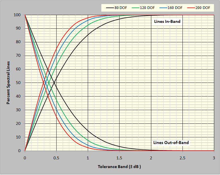
Figure 3: Percent of spectral lines expected within and outside of a (±dB) tolerance band.
Realtime Statistical Analysis During a Test
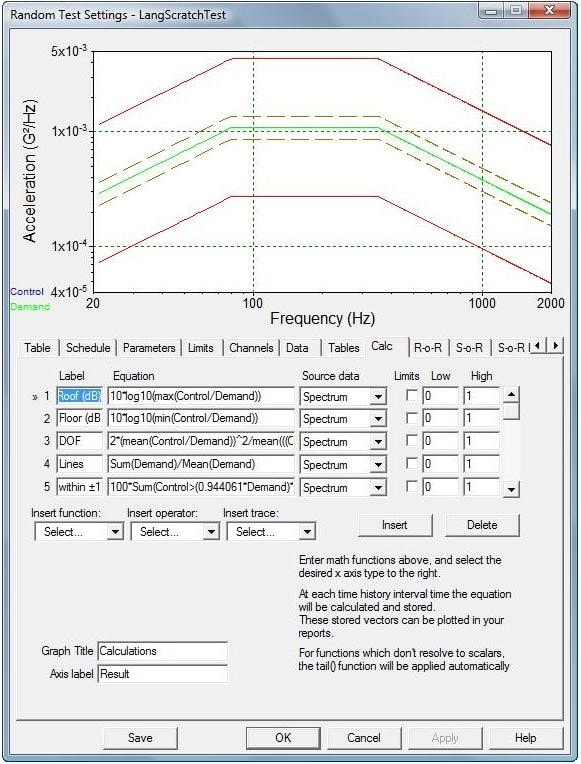
Figure 4: The CALC tab of a VibrationView test SETUP allows the addition of user-defined measurements to a test.
The Vibration Research’s VibrationVIEW® software provides the (optional) ability to embed custom calculators within a test. This facility can be used to provide real-time analysis of the control system’s statistical performance. Within the SETUP menu is the Calc tab, illustrated in Figure 4. Up to 32 algebraic equations may be entered here, defining complex user-defined functions to be evaluated and graphically reported throughout the duration of a random shake test. For example, entering the following six statements generated the 6 right-hand traces of Figures 1 and 5.
1) Roof (dB) = 10*log10(max(Control/Demand))
2) Floor (dB) = 10*log10(min(Control/Demand))
3) DOF = 2*(mean(Control/Demand))^2/mean(((Control/Demand)^2)-(Mean(Control/Demand))^2)
4) Within ±1/4 dB = 100*Sum(Control>(0.944061*Demand)*Control<(1.059254*Demand))/(Sum(Demand>0))
5) Within ±1/2 dB = 100*Sum(Control>(0.891251*Demand)*Control<(1.122018*Demand))/(Sum(Demand>0))
6) Within ±1 dB = 100*Sum(Control>(0.794328*Demand)*Control<(1.258925*Demand))/(Sum(Demand>0))
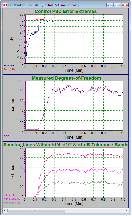
Figure 5: Statistics during the first minute of testing.
Figure 5 shows the same six statistics for the first few minutes of a 20 to 2,000Hz NAVMAT test using 800 lines of resolution and 80 degrees of freedom. It is especially interesting to watch these statistics during the initiation of a test. The upper roof and floor plots show the controller increasing the signal level toward the desired test level. It also illustrates the upper and lower bounds of the PSD estimation error converging to within about ±2dB of the Demand and remaining there throughout the test. The center plot shows the averaging process building up DOF as an increasing amount of data is gathered and included in the average. At about 0.3 minutes into the test, the target of 80 DOF is achieved. At this point, the roof and floor values have stabilized. The lower plot shows the Control error exceeded ±1dB for all lines until about 0.1 minutes into the test. Thereafter, all three tolerance bands illustrate an increasing percentage of lines within tolerance. At 0.3 minutes into the test, the ±¼, ±½, and ±1dB percentiles have all stabilized. As shown, 85% of all Control spectral lines are within ±1dB of the Demand, about 50% are within ±0.5dB and over 25% are within ±0.25dB throughout the test. (Compare these findings with the first column in Table 4.)
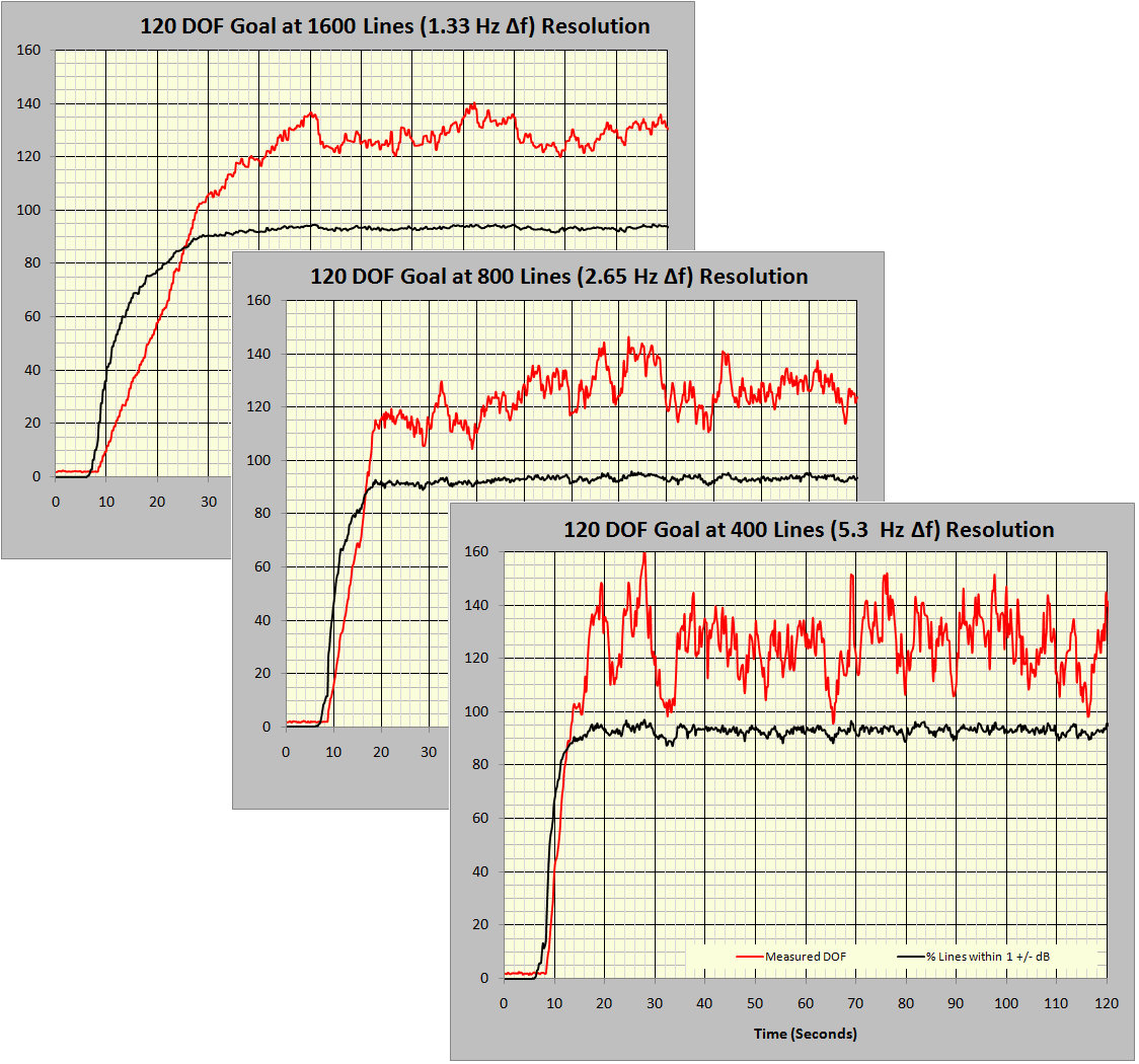
Figure 6: Effect of spectral resolution on the averaging epoch.
Figure 6 consolidates measurements from three 20 to 2,000Hz tests with 120 DOF specified, using 1,600, 800, and 400 lines of resolution. No other parameters were changed between these three tests. The red traces present the calculated DOF, while the black traces give the percent of control lines within ±1dB of the Demand profile. With a Gaussian signal and proper operation at 120 DOF, 92.4% of the spectral lines should be within ±1dB of the demand. Note that the time to specified DOF increases in almost direct proportion to the number of controller spectral lines selected. DOF/(2·Δf) is a good approximation of the time (seconds) required to converge on the desired variability if the controller is programmed to average only independent or non-redundant (not overlapped) data frames. This estimates the averaging epoch, that time required to charge the averaging process with sufficient spectra to produce the intended DOF. As shown in the following figures, if the controller is programmed to average overlapping frames (in combination with a tapered spectral window function) the epoch time can be reduced by a factor of nearly two.
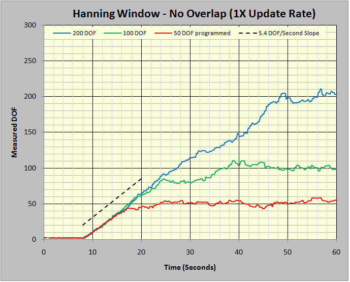
Figure 7: Ramp-up slope for independent data blocks.
Figure 7 provides the time histories of the measured DOF statistic during the start-up of three tests. These tests differed only by the number of DOF programmed. All three tests were constrained to average the Control PSD using only non-redundant (not overlapped) frames of captured time history. In all three tests, the Hanning window weighted the measured time history in the FFT processing. Note the initial ramp-up slope for all three tests was essentially equal and well approximated by 5.4 DOF/second.
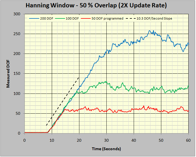
Figure 8: Ramp-up slope using 50% overlap averaging.
Figure 8 repeats the experiments of Figure 7 with a single difference: the averaging was specified to use a 50% overlap. That is, the continuously incoming time history was transformed (via FFT) twice during the time interval required to fill the input time data frame. This doubled the number of frames averaged per unit of time. Note that the DOF/second slope in Figure 8 is 10.3, nearly twice that of Figure 7. This, of course, sets the stage for greed.
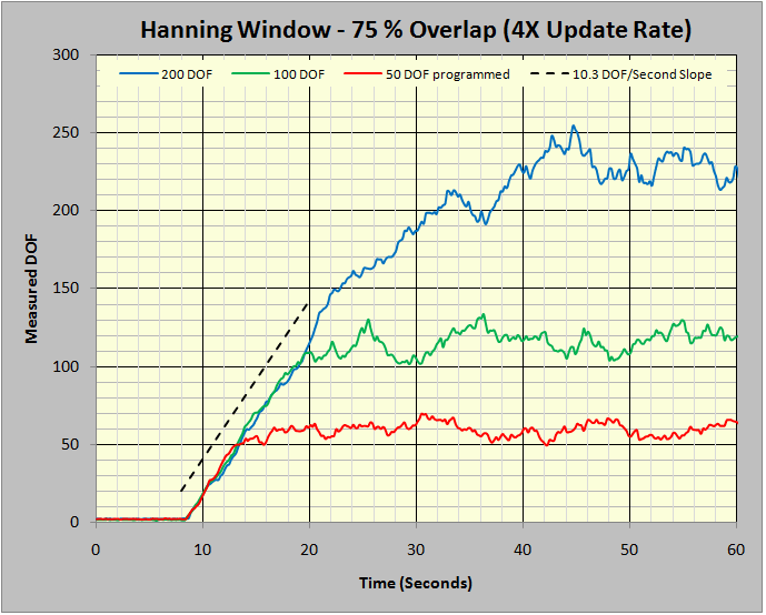
Figure 9: Ramp-up slope using 75 % overlap averaging.
However, avarice goes unrequited in this instance. Figure 9 illustrates what happens when we quadruple the averaging rate by specifying a 75% averaging overlap. There is no further improvement in the DOF/second slope, it remains at 10.3. Hence, averaging at more than 50% overlap offers no further improvement in variance reduction per unit of time. One further observation in this matter is worth making.
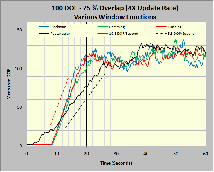
Figure 10: Overlap does not affect un-windowed FFTs.
Figures 7 through 9 all used the well-understood Hanning window as the weighting factor in the FFT. In Figure 10, four tests all focusing on 100 DOF were conducted, each using a different window function. The Hanning, Hamming, and Blackman windows are all industry-standard windows for the analysis of continuous signals such as random noise. The Rectangular window amounts to performing the FFT without using any weighting; it is only appropriate for the analysis of captured transients or periodic signals harmonically synchronized to the analyzer’s sample rate but is used here to illustrate a point. Note that this unweighted analysis only increased at 5.3 DOF/second. All three analyses run with tapered window functions improved at about 10.3 DOF/second. An explanation for this is the 50% overlap recovers some of the signal, which was discarded by the tapering edges of the window function.
Figures 7 through 9 make a telling point: overlapped processing can (nearly) double the number of DOF per 1/Δf time periods averaged when a 50% overlap is used. Increasing overlap beyond 50% offers no further advantage. In order to get this processing reward, the FFT must be performed using a window function that ‘tapers’ the leading and trailing edges of the time capture duration.
Free and Easy Statistical Evaluation Tool
It is possible that your controller cannot perform ancillary calculations of the sort just discussed, or that you don’t currently own the necessary optional software to implement embedded calculators (or to link your controller to other analysis software in a client/server relationship). Or, perhaps, you just don’t feel at ease programming data transfers and investigations. Here is a simple alternative using the most popular and widely distributed analysis program on planet Earth. Vibration Research offers a comprehensive spreadsheet compatible with any controller that can export its Demand and Control spectra to Excel®. There is no charge for this analysis software. Download a free copy.
To analyze your controller, export up to 2,048 lines of the Demand and Control PSDs (as text) from its display. Open the Control Statistics spreadsheet using Excel. Paste the frequency (Hz), Demand (g2/Hz), and Control (g2/Hz) into the (white) area indicated on the Input tab of the spreadsheet. An audit plot is automatically drawn; inspect this for proper form. Make four typed entries: Controller ID, Test ID, Lines, and DOF Controller Setting, and proceed to the DOF Curve-Fit tab.
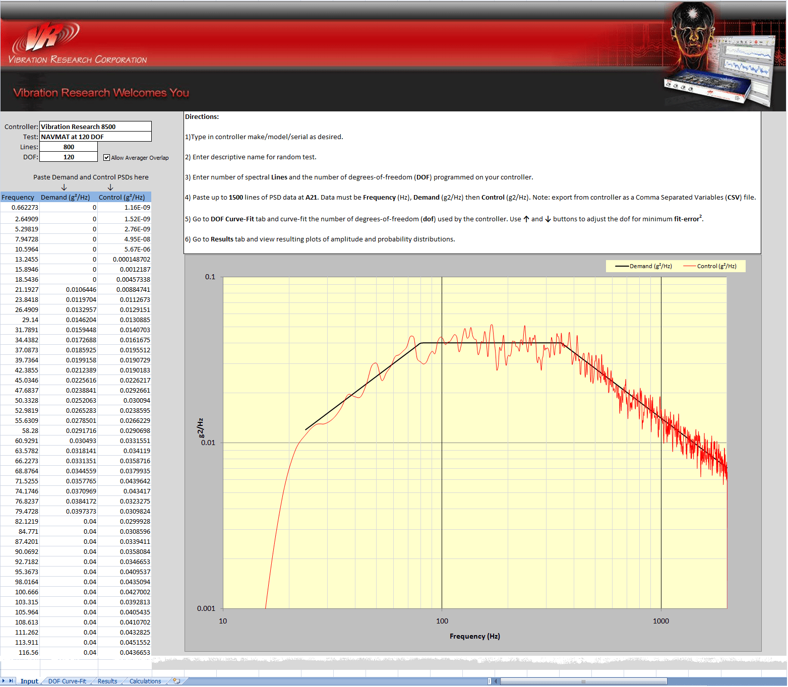
Figure 11: Input tab of the VRC Control Statistics spreadsheet with NAVMAT test on 8500.
The test illustrated in Figure 11 was exported from a VR8500 system using a standard VibrationVIEW® “Save As … Spreadsheet File” command. The Demand is the familiar NAVMAT 20 to 2,000Hz profile to be run at 800 lines of resolution with 120 degrees of freedom. The controller was allowed to start and stabilize before harvesting data. As a matter of good practice, three exports were made and analyzed to assure that each was typical.
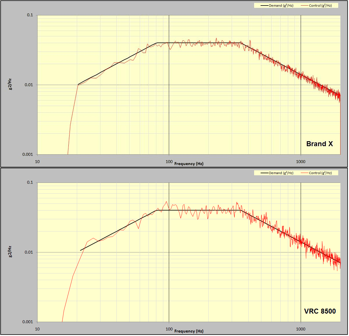
Figure 12: Comparison of NAVMAT test run on Brand X and VR8500 controllers.
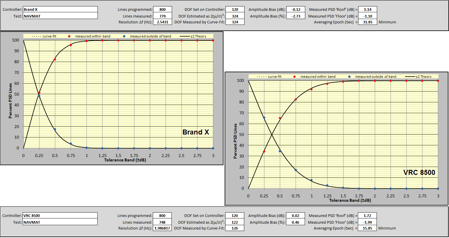
Figure 12 compares the same test exported from another manufacturer’s controller using their text-export facility. Every effort was made to exactly match the setup parameters on both systems. While the resulting two displays are obviously very similar, it appears that the competitive Brand X unit is providing tighter control with the less scattered departure of the (red) Control PSD from the (black) Demand spectrum. This is the kind of comparison purchase decisions have been made upon, and it deserves deeper study.
Figures 13 and 14 illustrate how to curve-fit a measurement (using the Brand X data). This is a two-step iterative procedure. Note that yellow cells repeat the DOF Controller Setting and provide an estimate of the DOF using equation (6) found in the appendix. Use the lower set of buttons to set the (white) offset dB to 0 and then adjust the upper pair to minimize the (blue) fit error2 reading. These upper buttons increase and/or decrease the CF DOF (curve-fit DOF) which determines the shape of the theoretical (black) Control Error CDF (cumulative distribution function) line in the adjacent plot. When the black line most closely fits the red dots of the experimentally-measured CDF, the blue cell displays the minimum error2.
At this point, the three DOF readings should be quite similar to one another and the black χ2 CDF line should pass through (or very close to) all of the measured red dots. However, it is possible that the fit can be improved by shifting the fitted curve left or right from the χ2 CDF to compensate for a controller bias error. Use the lower controls to shift the (dotted) curve-fit function left or right by an offset dB from the theoretical χ2 CDF. (Red increase or decrease ‘hints’ will appear to aid this effort.) Shift the curve-fit function, as required, to further minimize the blue fit error2 cell as shown in Figure 14. The right-most PDF also tracks these changes and compares the biased χ2 fit function to the measured data.
Iterate between the upper and lower button sets to assure that the absolute minimum fit error2 for your measurement has been found. Then proceed to the Results tab. Note that the CF DOF is the most precise estimate of degrees of freedom that the controller exhibits (within a specific instance of PSD display).
Figure 15 presents the curve fit of the VR8500 measurement for comparison. Note the lower central slope in the CDF indicating a broader range of amplitudes (greater Control-Demand difference) than the measurement of Figure 14. This is also reflected by the broader skirts of the right-hand PDF. Also, note the very small offset dB (0.02 dB) fitted to this measurement; the dotted curve-fit function and the solid line from χ2 theory are in closer agreement than for the Brand X controller. This closer match is indicative of more Gaussian-like signal behavior. Finally, note that both computed values of the DOF match closely with the value (120) entered as a set-up parameter.
In this example, both controllers targeted a 120 DOF controller setting. The VR8500 exhibited a 2(m/s)2 estimate (from equation 6) of 122 and a CF DOF of 126. In contrast, the Brand X controller exhibited a huge DOF discrepancy and strong evidence that its behavior was far from compliant with well-accepted Gaussian behavior. The 2(m/s)2 estimate was 324 DOF, in serious disagreement with the 120 DOF programmed into the controller. Before secondary fitting for bias error, the best-fit CF DOF was 294, however, there remained a large fit error2. Fitting a substantial -0.12 dB bias to this measurement and re-tuning the CF DOF to 324 minimized the fit error2.
Moving on to the Results tab provides a 13-item summary report and a Percent PSD Lines versus Tolerance Band (±dB) plot. Figure 16 compares the Brand X (upper and left) results with those of the VR8500. Note that over 99% of lines of the Brand X controller are within ± 1 dB of the Demand PSD. In contrast, only about 92% of the VR8500 Control PSD lines are within ±1dB of the Demand profile.
In short, the casual observation of Figure 12 suggesting a tighter control by Brand X is substantiated and numerically quantified. However, Table 4 tells us that a 120 DOF test should only have 92.4% of its Control PSD lines within ± 1dB of the Demand. While the VR8500 delivered a performance in close agreement with χ2 theory for 120 DOF, the Brand X machine provided that tighter spectral picture. As statistics theory tells us, either the controller is not honoring the requested DOF setting, or the signal being analyzed is significantly non-Gaussian. Either case is a situation worthy of a very serious discussion with the manufacturer.
Independent Analysis of the Control Signal Time-History
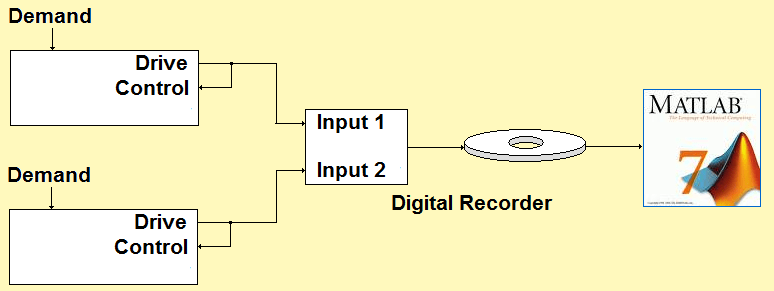
Figure 17: Independent analysis compares two controllers.
Brand X is clearly delivering a picture suggesting tighter control than its DOF setting and χ2 theory would support. But is it really delivering tighter control? We will settle this conundrum by using independent analysis; Figure 17 illustrates the scheme. The VR8500 and the Brand X controller were both programmed to control the same 120 DOF NAVMAT “loopback” test. Their Drive output time histories were simultaneously recorded and the resulting (large) disk file was converted to a .MAT format for analysis using MATLAB®. An M-file script was written to compute the PSDs of the two Drive signals. The averaging was performed at exactly 120 DOF by averaging 60 unique input blocks.
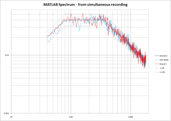
Figure 18: Independently measured PSDs of the two controller Drive signals.
Figure 18 compares the resulting spectra. Note that the two controlled time histories actually exhibit very similar spectral dispersion when analyzed by an independent spectrum analyzer. This was reaffirmed by capturing the (text) results of Figure 18 and analyzing them using the control statistics spreadsheet. The results are shown in Figure 19.
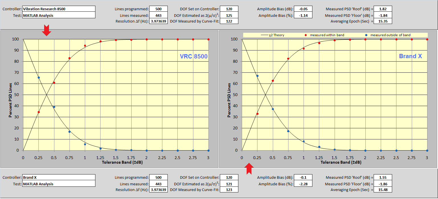
Figure 19: Spreadsheet results for MATLAB spectra of two controllers.
Note the close agreement of results between the two controllers. Of course, the 60 non-overlapped blocks averaged by MATLAB caused both PSDs to exhibit very nearly 120 DOF. (Remember, the DOF is a property of a PSD, not the signal being analyzed.) Note the very similar measured dispersion (about 92 % within ±1 dB) of the red dot patterns exhibited by the two instruments. Most importantly, note the similarity of both results with the VR8500 results of Figure 16. Clearly, the Brand X controller gave a misleading and self-aggrandizing impression of its performance by using inappropriate parameters in its PSD calculation.
Cross-Analysis Provides Interesting Insight

Figure 20: Cross-Controller test scheme.
A variation on the independent analysis scheme is to pit two controllers against one another as shown in Figure 20. The two controllers run the same loopback test simultaneously. Each controller monitors the other’s Drive signal using an auxiliary input channel. The PSDs of both the Control and Monitor signals are captured from the displays of both instruments. The analysis of both signals as monitored by each controller can be performed using the control statistics spreadsheet.
Using this method, the VR8500 was simultaneously compared against controllers manufactured by three different competitors. The four controllers were cross-wired and a standard NAVMAT profile of 800 lines and 120 DOF was programmed into each machine. Further, the Drive outputs of all four controllers were simultaneously recorded and then independently spectrum analyzed using MATLAB. The comparative results are summarized in Table 1. Note that the DOF estimation itself has some variability, as can be seen in Figures 6 through 10. For all cases reported in Table 1, the DOF was estimated from multiple independent PSD measurements, and the median value of all results is listed in the table.
Table 1: Results of 120 DOF Cross-Controller Tests with Brands X, Y and Z
| PSD Measured
by → |
VR8500
(120 DOF) |
Brand X
(120 DOF) |
Brand Y
(120 DOF) |
Brand Z
(120 DOF) |
MATLAB
(120 DOF) |
|
| VR8500 | 121 | 234 | 115 | 227 | 122 | |
| Signal | Brand X | 92 | 278 | 94 | 163 | 90 |
| Source | Brand Y | 93 | 179 | 129 | 167 | 83 |
| Brand Z | 144 | 288 | 142 | 292 | 155 |
Table 1 reveals some large differences between the four controllers. Most strikingly, the numbers derived from the Brand X and Brand Z screens are approximately double what one would expect when requesting a DOF of 120. This indicates that those two controllers are not honoring the DOF value entered, but rather are using double the requested value. By using twice as much averaging as was requested by the operator, these controllers give an apparently flatter PSD than the controllers which actually use the requested amount of averaging.
This begs for another test, using a requested DOF of 60 for the Brand X and Brand Z controllers, and a requested DOF of 120 for the VR8500, Brand Y, and Matlab analysis. If Brand X and Brand Z are indeed doubling the requested DOF, then this will give similar results on all four controllers, and allow for a 1-to-1 comparison of the results. The results of this test are shown in Table 2.
Table 2: Results of 60 and 120 DOF Cross-Controller Tests with Brands X, Y and Z
| PSD Measured
by → |
VR8500
(120 DOF) |
Brand X
(60 DOF) |
Brand Y
(120 DOF) |
Brand Z
(60 DOF) |
MATLAB
(120 DOF) |
|
| VR8500 | 119 | 118 | 122 | 115 | 119 | |
| Signal | Brand X | 102 | 137 | 106 | 98 | 98 |
| Source | Brand Y | 94 | 85 | 134 | 92 | 86 |
| Brand Z | 145 | 146 | 150 | 149 | 156 |
In Table 2, we find that all four controllers, when analyzing the outputs of their peers, give results consistent with the independent MATLAB analysis. However, when the Brand X and Brand Y controllers evaluate their own output, they give notably higher DOF estimates. This means the control signal traces that those controllers present on-screen are significantly smoother than is supported by independent analysis.
Now consider the behavior of the four signals as analyzed by the other controllers. The laws of statistics tell us that if the signal is Gaussian, then the PSD will have a Chi-squared probability distribution with 120 DOF. When the VR8500 output is examined by all five analyzers the results are within +2/-4 % of the expected 120 DOF, indicating the VR8500 output is consistent with the Gaussian probability theory. However, the output signals of both Brand X and Brand Y were significantly lower than the expected 120 DOF, and the output signal of Brand Z was significantly higher than the expected 120 DOF. These numbers cast a strong suspicion that the Drive signals of all three competitive systems depart from Gaussian form in some significant manner.
Conclusions
Why does the spectrum generated by a Vibration Research controller (without using iDOFTM) look ragged? Because it is supposed to look exactly that way. Evidence now exists that some commercial random controllers actually use more than the number of DOF specified in their setup parameters for PSD calculation. This error can result in the appearance of a tighter ±dB match between the Demand and Control spectra than theory and the operator-entered DOF support. Controllers made by two different manufacturers have been found with this defect. Strong evidence of non-Gaussian signal behavior has also been found in controllers offered by three competitors.
Several testing methods to disclose and characterize such undesirable statistical behavior have been discussed and demonstrated. The simple use of a spreadsheet combined with text export of an instrument’s PSDs makes very good sense. The test is simple to perform and meaningful answers can be had with just a few minutes work. If your controller does respect the laws of physics and probability, the tables and graphs in this article can aid your test design and planning efforts. If your controller doesn’t understand the χ2 distribution, it can confuse and confound your effort to conduct your tests scientifically. Don’t let this happen.
What is the χ2 distribution? (Appendix)
The Chi-square (χ2) distribution is a probability density function (PDF), an equation describing the likelihood that a sample’s amplitude will be within certain bounds. Like the strongly related normal, or Gaussian, distribution, this statistical model fits very well with observations we can make of the world around us. However, the χ2 is only applicable to the very specialized circumstance where each constituent in the population to be analyzed has been formed by squaring samples drawn from a Gaussian population and summing (or averaging) a fixed number of them. Random shaker control is one of those situations that fit this model exactly.
The random shaker-controller functions to produce a broad-band noise with a controlled spectral shape, matching the power spectral density (PSD) prescribed by the Demand reference profile. The amplitude statistics of the resulting Control acceleration time-waveform are Gaussian and this may be verified by measuring an amplitude histogram and seeing its close match to a Gaussian PDF curve. (See Figure 1, lower-left, for example.)
Within the control loop, the PSD of the controlled signal is continuously measured, monitored, and compared against the desired profile as well as alarm and abort safety limits. Further, this fundamental measure of control success is continuously displayed to the operator. The PSD is measured by power averaging a sequence of instantaneous spectra calculated by using the fast Fourier transform (FFT). An FFT produces a complex spectrum; at every line (frequency point), a real and imaginary spectral amplitude is calculated. Like the time history from which they come, the real and imaginary components (independently) are Gaussian distributed variables, because the FFT is a linear transform. Interestingly, the vector resultant, or magnitude, of these components is not distributed in accordance with the Gaussian bell curve. Instead, it is governed by the Rayleigh distribution, yet another classic statistical distribution (which will not be discussed here).
Each FFT spectrum measured is multiplied by its own complex conjugate to produce an instantaneous power spectrum with a real spectral amplitude equal to the sum of a squared real component and a squared imaginary component. That is, at every frequency the instantaneous power spectral amplitude is the sum of two squared Gaussian components or degrees of freedom (DOF). When N such squared spectra are ensemble-averaged, each resulting spectral line reflects the contribution of 2N DOF. Thus, the χ2 distribution describes the power amplitude statistics of both instantaneous and averaged power spectra.
The χ2 distribution is only defined for a positive sample amplitude, x. Unlike the bell-shaped Gaussian distribution, the χ2 cannot be normalized to a single symmetric shape. Instead, its shape is skewed, or asymmetric. Further, that shape changes with the number of DOF in the population samples. Equation (1) describes the χ2 PDF which is illustrated in Figure 21.
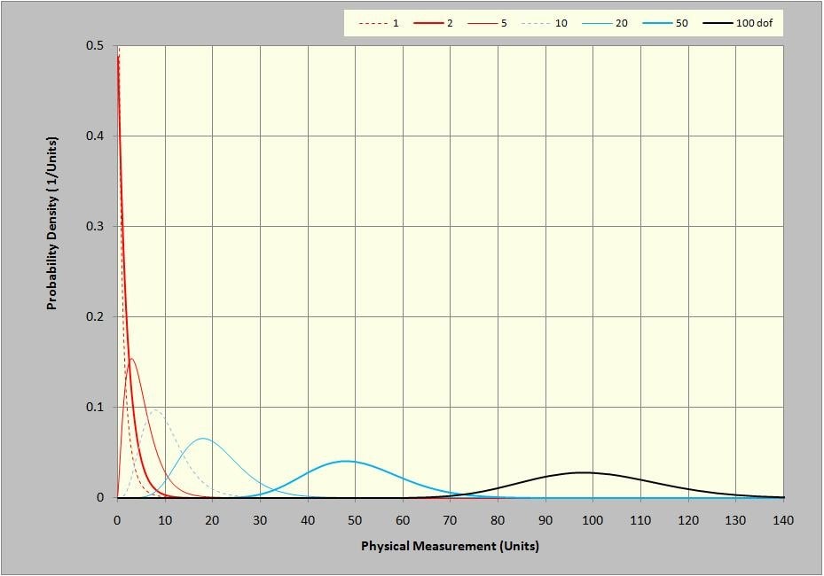
Figure 21: χ2 PDF for 1, 2, 5, 10, 20, 50 and 100 DOF.

Where:
![]() is the χ2 probability density function (PDF)
is the χ2 probability density function (PDF)
x represents a (positive) amplitude proportional to a sample from a “sum of squares” population
k is a positive integer representing the degrees of freedom (the number of squared samples summed)
e is the base of the Napierian or natural logarithm (2.7182…)
! indicates factorial expansion (i.e. 3! = 3·2·1 = 6)
Figure 21 is clearly very different than the normal bell-curve Gaussian PDFs we are used to looking at. However, it shares some common characteristics with that more familiar function. Firstly, the area under each PDF is equal to 1.0 and is non-dimensional. This is reflected by the units of the PDF plot in Figure 21, wherein the vertical axis units are the reciprocal of the horizontal axis units. In contrast, the vertical units of a histogram, (an uncalibrated PDF) are expressed in counts (or percent of counts measured).
That is, by definition:

The running integral of the PDF (spanning amplitude of 0 to 1.0) is termed the cumulative distribution function (CDF) and is shown in Figure 22. Note that this function is quite similar in general form to the CDF for other statistical distributions, including the Gaussian. It presents the area under the curve of Figure A1 as x increases from zero toward infinity.

The integral operation of (3) is more simply accomplished by simply subtracting the appropriate amplitude at x=b from that at x=a in Figure 22.
The shapes of the seven PDF curves presented in Figure 21 can better be appreciated by scaling the plot axes. If the horizontal axis values are divided by the DOF and the vertical axis values are multiplied by the same factor, the area under each curve remains 1.0 and the peak value of the curves is reached slightly to the left of x/DOF=1.0. This is shown in Figure 23 using the same data shown in Figure 21.
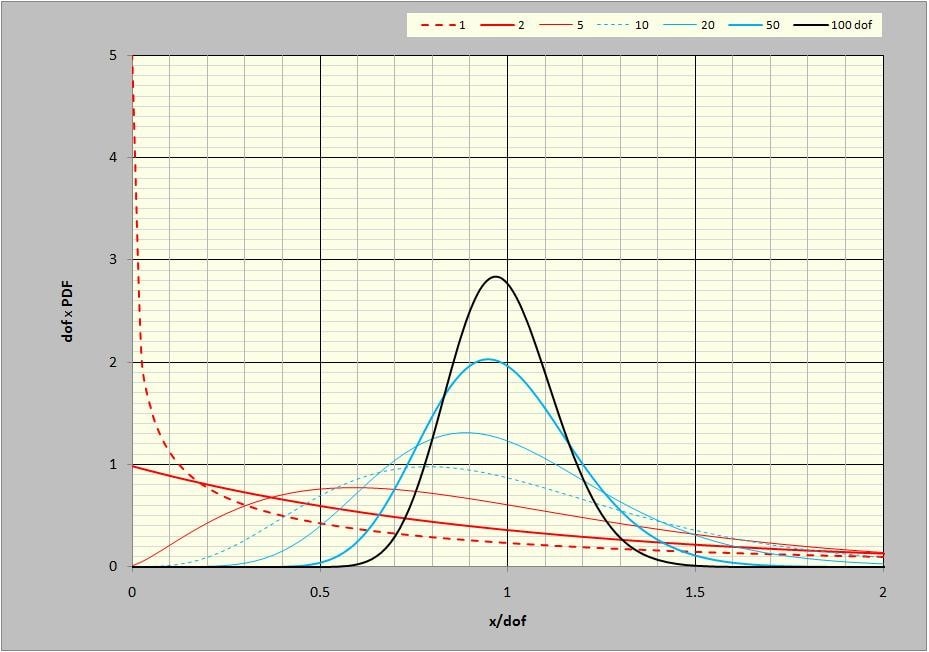
Figure 23: DOF-scaled χ2 PDF curves at 1, 2, 5, 10, 20, 50, and 100 DOF.
It is clear that the χ2 PDF changes shape quite dramatically with DOF. For a single DOF, the PDF has an almost 1/x character. At 2 DOF, as a result of a single FFT spectrum, it has a decaying-exponential form. As the DOF increase, a dominant peak value is found near x=k. In fact, the χ2 distribution has a mean value, equal to exactly the DOF, k, in accordance with:

Where: ![]() are samples taken from a population governed by the distribution,
are samples taken from a population governed by the distribution, ![]()
![]() is a scale constant relating
is a scale constant relating![]() to x
to x
It is also interesting to note that ![]() has a variance,
has a variance, ![]() , equal to exactly 2k. That is:
, equal to exactly 2k. That is:

This leads to a very interesting and useful relationship (6) from which the DOF can be measured experimentally. (See the third equation discussed in Realtime Analysis During a Test, for example.)

Useful Tables
Table 3: Confidence Limits (dB) for χ2 distributed variable at various percent Confidence and Degrees-of-Freedom
| Confidence → | 99.9% | 99% | 95% | 90% | ||||
| DOF ↓ 80 | 2.05 | -2.52 | 1.63 | -1.94 | 1.25 | -1.46 | 1.05 | -1.22 |
| 100 | 1.85 | -2.23 | 1.47 | -1.72 | 1.12 | -1.29 | 0.95 | -1.08 |
| 120 | 1.70 | -2.01 | 1.35 | -1.56 | 1.03 | -1.17 | 0.87 | -0.98 |
| 140 | 1.59 | -1.85 | 1.25 | -1.43 | 0.96 | -1.08 | 0.81 | -0.91 |
| 160 | 1.49 | -1.72 | 1.18 | -1.33 | 0.90 | -1.01 | 0.76 | -0.84 |
| 180 | 1.41 | -1.62 | 1.11 | -1.25 | 0.85 | -0.95 | 0.72 | -0.79 |
| 200 | 1.34 | -1.53 | 1.06 | -1.18 | 0.81 | -0.90 | 0.68 | -0.75 |
| 220 | 1.28 | -1.45 | 1.01 | -1.13 | 0.77 | -0.85 | 0.65 | -0.71 |
| 240 | 1.23 | -1.39 | 0.97 | -1.08 | 0.74 | -0.81 | 0.62 | -0.68 |
| 260 | 1.19 | -1.33 | 0.94 | -1.03 | 0.72 | -0.78 | 0.60 | -0.65 |
| 280 | 1.15 | -1.28 | 0.90 | -0.99 | 0.69 | -0.75 | 0.58 | -0.63 |
| 300 | 1.11 | -1.23 | 0.87 | -0.96 | 0.67 | -0.72 | 0.56 | -0.61 |
Table 3 presents commonly sought points from Figure 2 while table 4 summarizes useful planning points from Figure 3.
Table 4: Percent Probability of 1 Line being within a ±dB Band for various Degrees-of-Freedom
| DOF → | 80 | 100 | 120 | 140 | 160 | 180 | 200 |
| ±0.25 dB | 28.36 | 31.55 | 34.38 | 36.95 | 39.29 | 41.46 | 43.48 |
| ±0.50 | 53.23 | 58.34 | 62.66 | 66.37 | 69.61 | 72.45 | 74.97 |
| ±0.75 | 72.36 | 77.65 | 81.77 | 85.03 | 87.65 | 89.77 | 91.49 |
| ±1.00 | 85.26 | 89.48 | 92.40 | 94.47 | 95.94 | 97.01 | 97.79 |
| ±1.25 | 92.90 | 95.64 | 97.28 | 98.29 | 98.91 | 99.31 | 99.55 |
| ±1.50 | 96.89 | 98.39 | 99.15 | 99.55 | 99.76 | 99.87 | 99.93 |
| ±1.75 | 98.75 | 99.47 | 99.77 | 99.90 | 99.95 | 99.98 | 99.99 |
| ±2.00 | 99.53 | 99.84 | 99.94 | 99.98 | 99.99 | 100.00 | 100.00 |
| ±2.25 | 99.83 | 99.95 | 99.99 | 100.00 | 100.00 | 100.00 | 100.00 |
| ±2.50 | 99.94 | 99.99 | 100.00 | 100.00 | 100.00 | 100.00 | 100.00 |
| ±2.75 | 99.98 | 100.00 | 100.00 | 100.00 | 100.00 | 100.00 | 100.00 |
| ±3.00 | 99.99 | 100.00 | 100.00 | 100.00 | 100.00 | 100.00 | 100.00 |
A question often asked about a Control PSD is: “What is the probability that some specified number or all of the spectral lines will fall within ±1 dB (or some similarly specified tolerance band)?” The answer depends upon the probability of any single line falling within the band (Pany) and upon the number of PSD Lines in question, Pany given by table 3.
If Pany is the probability of a single Control Line falling within ±x dB of the Demand, then:

Where:
PL is the probability of L Lines in the spectrum being within the same ±x dB span
L is the number of Lines that must all exhibit spectral amplitude within ±x dB
Table 5 presents equation (7) results for 10 Lines, inasmuch as some test specifications require that no more than one outlier occurs within any contiguous 10 spectral lines.
Table 6: Percent Probability of 10 Lines being within a ±dB Band for various Degrees-of-Freedom
| DOF → | 80 | 100 | 120 | 140 | 160 | 180 | 200 |
| ±0.25 dB | 0.00 | 0.00 | 0.00 | 0.00 | 0.01 | 0.02 | 0.02 |
| ±0.50 | 0.18 | 0.46 | 0.93 | 1.66 | 2.67 | 3.99 | 5.61 |
| ±0.75 | 3.94 | 7.97 | 13.37 | 19.76 | 26.76 | 33.97 | 41.10 |
| ±1.00 | 20.30 | 32.89 | 45.36 | 56.59 | 66.10 | 73.83 | 79.97 |
| ±1.25 | 47.89 | 64.02 | 75.92 | 84.15 | 89.65 | 93.27 | 95.63 |
| ±1.50 | 72.94 | 85.05 | 91.86 | 95.58 | 97.60 | 98.69 | 99.28 |
| ±1.75 | 88.18 | 94.78 | 97.69 | 98.97 | 99.53 | 99.79 | 99.90 |
| ±2.00 | 95.40 | 98.37 | 99.41 | 99.79 | 99.92 | 99.97 | 99.99 |
| ±2.25 | 98.34 | 99.53 | 99.86 | 99.96 | 99.99 | 100.00 | 100.00 |
| ±2.50 | 99.44 | 99.87 | 99.97 | 99.99 | 100.00 | 100.00 | 100.00 |
| ±2.75 | 99.82 | 99.97 | 99.99 | 100.00 | 100.00 | 100.00 | 100.00 |
| ±3.00 | 99.94 | 99.99 | 100.00 | 100.00 | 100.00 | 100.00 | 100.00 |
Table 6 presents equation (7) results when all lines of a 400 line spectrum must be within ±x dB of the Demand.
Table 6: Percent Probability of 400 Lines being within a ±dB Band for various Degrees-of-Freedom
| DOF → | 80 | 100 | 120 | 140 | 160 | 180 | 200 |
| ±0.25 dB | 0.00 | 0.00 | 0.00 | 0.00 | 0.00 | 0.00 | 0.00 |
| ±0.50 | 0.00 | 0.00 | 0.00 | 0.00 | 0.00 | 0.00 | 0.00 |
| ±0.75 | 0.00 | 0.00 | 0.00 | 0.00 | 0.00 | 0.00 | 0.00 |
| ±1.00 | 0.00 | 0.00 | 0.00 | 0.00 | 0.00 | 0.00 | 0.01 |
| ±1.25 | 0.00 | 0.00 | 0.00 | 0.10 | 1.27 | 6.16 | 16.71 |
| ±1.50 | 0.00 | 0.15 | 3.35 | 16.41 | 37.79 | 58.92 | 74.84 |
| ±1.75 | 0.65 | 11.72 | 39.21 | 65.96 | 82.91 | 91.81 | 96.15 |
| ±2.00 | 15.23 | 51.89 | 79.05 | 91.77 | 96.86 | 98.81 | 99.55 |
| ±2.25 | 51.29 | 82.87 | 94.71 | 98.41 | 99.52 | 99.86 | 99.96 |
| ±2.50 | 79.76 | 95.08 | 98.85 | 99.73 | 99.94 | 99.98 | 100.00 |
| ±2.75 | 92.95 | 98.74 | 99.78 | 99.96 | 99.99 | 100.00 | 100.00 |
| ±3.00 | 97.78 | 99.70 | 99.96 | 99.99 | 100.00 | 100.00 | 100.00 |
Table 7 presents equation (7) results when all lines of an 800 line spectrum must be within ±x dB of the Demand.
Table 7: Percent Probability of 800 Lines being within a ±dB Band for various Degrees-of-Freedom
| DOF → | 80 | 100 | 120 | 140 | 160 | 180 | 200 |
| 0.25 dB | 0.00 | 0.00 | 0.00 | 0.00 | 0.00 | 0.00 | 0.00 |
| 0.50 | 0.00 | 0.00 | 0.00 | 0.00 | 0.00 | 0.00 | 0.00 |
| 0.75 | 0.00 | 0.00 | 0.00 | 0.00 | 0.00 | 0.00 | 0.00 |
| 1.00 | 0.00 | 0.00 | 0.00 | 0.00 | 0.00 | 0.00 | 0.00 |
| 1.25 | 0.00 | 0.00 | 0.00 | 0.00 | 0.02 | 0.38 | 2.79 |
| 1.50 | 0.00 | 0.00 | 0.11 | 2.69 | 14.28 | 34.71 | 56.01 |
| 1.75 | 0.00 | 1.37 | 15.38 | 43.51 | 68.73 | 84.30 | 92.45 |
| 2.00 | 2.32 | 26.92 | 62.49 | 84.21 | 93.83 | 97.64 | 99.10 |
| 2.25 | 26.30 | 68.68 | 89.70 | 96.84 | 99.05 | 99.71 | 99.91 |
| 2.50 | 63.61 | 90.40 | 97.71 | 99.46 | 99.87 | 99.97 | 99.99 |
| 2.75 | 86.39 | 97.50 | 99.55 | 99.92 | 99.99 | 100.00 | 100.00 |
Authors: George Fox Land, Independent Consultant, Hatfield PA & Philip Van Baren, VP/Engineering, Vibration Research
Published: Sound & Vibration Magazine, October 2009 pp 8-16.


